Hiked It and Liked It Font: A Web Designer’s Layout Test
I was staring at a Figma file for an outdoor gear boutique, feeling completely stuck. The client wanted a brand identity that felt rugged and adventurous but still clean enough for a modern e-commerce experience. Every sans serif display font I tested looked too corporate, and every handwritten script felt too messy for product headers. That is when I dropped Hiked It and Liked It into the hero section. Instantly, the layout clicked. This hand-crafted sans serif display font brings a specific texture that standard geometric typefaces simply cannot replicate.
As web designers and digital creators, we know that choosing a typeface is never just about aesthetics. It is about communication, hierarchy, and user experience. Testing this font in a live project revealed exactly where it shines in digital layouts and where you need to exercise caution to maintain usability. Here is my practical breakdown of integrating this unique typeface into a responsive web environment.
First Impressions in the Hero Section
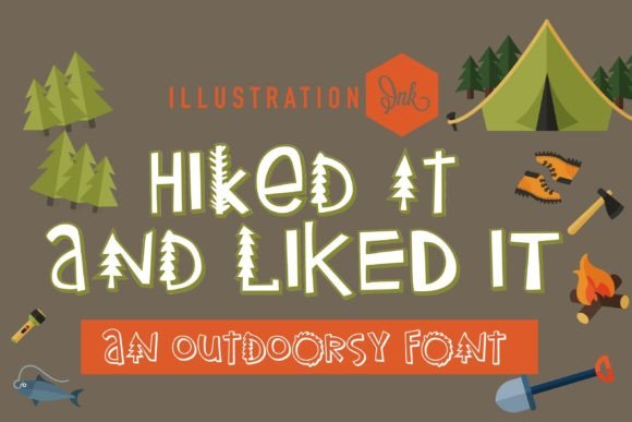
The true test of any display font happens in the hero banner. For this project, I placed Hiked It and Liked It over a high-contrast photograph of a mountain ridge. The font features subtle illustrations of trees and peaks integrated directly into the letterforms. On a desktop screen at 72px, these details were crisp and legible. The wild mountains and trees act as visual anchors, drawing the eye across the headline without requiring additional iconography or decorative elements.
What stood out immediately was the personality. It manages to be playful and professional simultaneously. In UI design, we often struggle to convey "outdoorsy" without resorting to clichés. This typeface solves that problem through form rather than decoration. However, because the characters are illustrative, I had to adjust the line height significantly. Standard tight tracking caused the tree tops on uppercase letters to collide with descenders on the line above. Giving the text breathing room preserved the integrity of each character and improved overall readability.
The 3D Version: Depth Without Performance Cost
The inclusion of a 3D version is a massive asset for digital product creators. Initially, I worried that using a textured 3D font might require heavy WebGL assets or complex CSS shadows that could slow down page load times. Fortunately, the 3D style is baked into the vector outlines. This means you get the depth and tactile feel of dimensional typography with the performance footprint of a standard webfont.
I utilized the 3D variant specifically for the primary Call-to-Action (CTA) button text and short promotional banners. The added weight and shadow effect created a natural focal point against flat background colors. It established a clear visual hierarchy: the 3D version signaled interactivity and importance, while the standard flat version worked beautifully for secondary headings and section titles. This distinction helped guide user scanning behavior without relying solely on color contrast.
Readability and Responsive Behavior
A beautiful font fails if it becomes illegible on mobile. When resizing the artboard to 375px, I had to make deliberate choices. Hiked It and Liked It is undeniably a display font, meaning it loses its charm and clarity below certain sizes. On mobile viewports, I set a minimum font size of 24px for headlines. Anything smaller caused the intricate tree details to blur into visual noise, especially on lower-resolution screens.
For the boutique store’s navigation menu and product descriptions, I switched to a neutral, highly legible sans serif body font. This pairing is critical. The decorative nature of Hiked It and Liked It demands a quiet partner. Using another stylized font for supporting copy would have created cognitive overload. By keeping the body text simple, the display font could perform its job of setting the mood without exhausting the reader. This balance is essential for maintaining brand trust and ensuring users can actually find the information they need.
- Mobile Headlines: Keep above 24px to preserve illustrative details.
- Contrast Checks: Ensure WCAG compliance when placing textured letters over busy images.
- Touch Targets: If using in buttons, ensure padding accommodates the taller vertical metrics.
- Loading Strategy: Use font-display: swap to prevent invisible text during load.
Strategic Applications Across Digital Touchpoints
Beyond the main website header, I found several high-impact use cases for this typeface throughout the digital ecosystem. For the blog redesign, it worked exceptionally well for category tags and featured post titles. It gave the editorial content a magazine-like quality that differentiated the blog from standard Shopify templates. In email marketing campaigns, the flat version rendered consistently across major clients like Gmail and Outlook, whereas the 3D version was best reserved for static image headers to avoid rendering issues.
For social media graphics and digital ads, this font is a conversion driver. In a crowded feed, the organic shapes break the grid of standard UI typography. I used it for Instagram Story templates and Pinterest pins promoting new gear arrivals. The inherent "hand-crafted" vibe signals authenticity, which is crucial for lifestyle brands. Users associate this level of typographic detail with premium, curated experiences rather than mass-market dropshipping stores.
Pairing for Brand Consistency
Successful implementation requires thinking about the entire brand kit. While Hiked It and Liked It carries the emotional weight, your functional typography must carry the utility. I paired it with a grotesque sans serif for interface elements like filters, cart summaries, and footer links. This combination creates a cohesive system where the display font acts as the voice of the brand, and the utility font acts as the infrastructure.
If you are designing for a coaching website or portfolio, consider pairing it with a clean serif font for long-form reading. The contrast between the rugged, illustrated sans serif headers and elegant serif body copy creates a sophisticated, editorial aesthetic. This approach works particularly well for storytelling pages where you want to maintain engagement over longer scroll depths.
Licensing and Technical Considerations
Before committing to this font for a client project or commercial product, always verify the licensing terms. Display fonts with illustrative elements sometimes have different commercial restrictions compared to standard text faces. Ensure your license covers web embedding, app usage, and digital advertising if those are part of your scope. Additionally, check the character set. Hand-crafted fonts sometimes lack extended language support or specific symbols needed for global e-commerce sites.
From a technical standpoint, optimize your webfont files. Since this typeface contains detailed vectors, the file size may be larger than a standard system font. Subsetting the font to include only the characters used on your site can significantly improve performance. Also, test the fallback stack rigorously. Because the metrics of Hiked It and Liked It are unique, your fallback font should have similar proportions to prevent drastic layout shifts while the custom font loads.
Integrating Hiked It and Liked It into a real-world project proved that niche display fonts can drive tangible UX improvements when applied with intention. It transformed a generic layout into a branded experience that felt authentic and engaging. For web designers looking to add warmth and narrative to their digital work, this typeface offers a powerful tool—provided you respect its boundaries regarding size, spacing, and pairing. It is not just a font; it is a design element that does the heavy lifting of visual storytelling.